 Last year SAP launched a new predictive solution for the BusinessObjects Business Intelligence Platform. Prior to 2012, SAP had partnered with SPSS to provide predictive functionality; however once SPSS was acquired by IBM, it was time for SAP to develop their own solution. This gave birth to Predictive Analysis.
In version 1.0, Predictive Analysis was built leveraging the Eclipse framework. Since then, the Predictive Analysis Interface has been merged with Visual Intelligence and provides customers with a powerful predictive analytics and visualization solution.
When Do I Use Predictive?
Predictive Analysis should be used anytime you need leverage a predictive algorithm to get additional insights based on statistical modelling. Here is the wiki site which talks about predictive analysis in more detail.
Since Utilities is my primary area of focus, here a quick post I wrote about the different Predictive Use Cases for Utilities. Predictive Analysis is widely used in most industry verticals for different use cases. It is probably most widely used in retail as organizations look for ways of increase their share of the customer wallet.
(Here is more information on my BI decision tree.)
How to Build a Predictive Model
Using Predictive Analysis is extremely easy. Organizations can easily access corporate data and use that corporate data to gain new insights that allow them to decrease cost and increase profitability and efficiency.
In the case, I would like to see how I might predict the propensity of my transformers to failure. I will look at historical and current asset data together with failure rates and see if I can predict which assets are most prone to failure.
Connecting to the Data
With Predictive Analysis you can access any data from any of your corporate or local data sources. In my case I’ll be using a local Excel spreadsheet which contains the key failure data I’ll need for this exercise. If you’d like you can download it here:
http://trustedbi.com/images/blog/pa/Transformer_Failures.zip
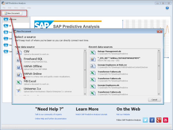 Step 1 – Connect to Data
Although I can pull information from a Universe or HANA, I am selecting an Excel spreadsheet called Transformer Analysis.
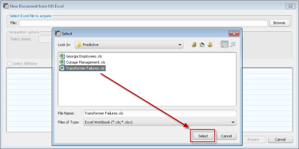 Step 2 – Select the Excel data source
Now I can preview the data and confirm I have the correct data set. I can choose to exclude columns if I wish to.
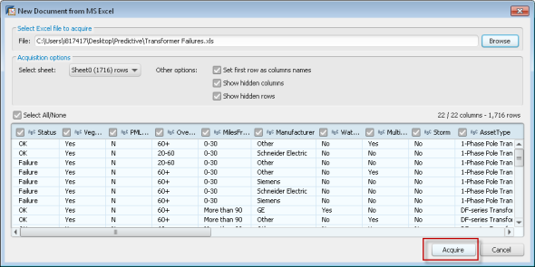 Step 3 – Preview and Read the data into Predictive Analysis
Once the data has been loaded, you can begin to look through the data, visualize it and analyze if for additional insights. In our data set, the key columns we will be looking at are:
- Status: OK/Failure – what is the current status of this asset
- Attribute Fields: VegMgmt, Overloads, PM Late, Miles From Ocean, etc. – these are fields that will help us determine if we can predict future failure
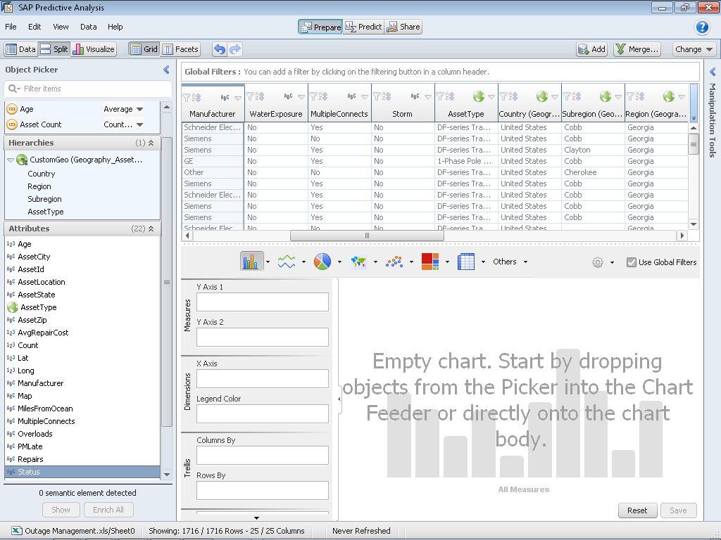 Step 4 – Now we have full capabilities to Manipulate and Visualize the Data
Building the Model
 Step 5 – Change Prespective from Prepare to Predict
Now that I am in the Predict perspective, I can select from any number of prebuilt functions. A short overview of what these functions are used for can be found here. Here is a screenshot of those functions:
 PreBuilt Predictive Functions (Click for full size)
For this predictive exercise, we will use a Decision Tree. We will use the attributes of the data to see what influences or predicts the likelihood of failure. Double click on the R-CNR Tree and it will be added to the workspace.
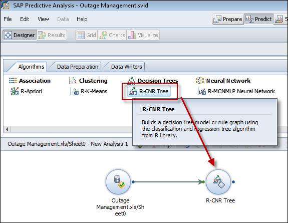 Step 6 – Select the R-CNR Algorithm
Next, hover over the R-CNR algorithm and select the properties tab.
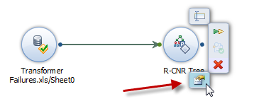 Step 7 – Modify the Properties
The properties dialog for the R-CNR Tree algorithm will appear. Here we want to specify which column we are trying to predict and which fields will influence that prediction. Therefore we will specify Status as the independent column. All the remaining columns will be influencers. In my example I selected: Status, VegMgmt, PMLate, Overloads, MilesFromOcean, Manufacturer, WaterExposure, MultipleConnects, Storm, AssetType, Repairs.
I also changed the name of the “Newly Added Columns” from PredictedValues to PredictedStatus .
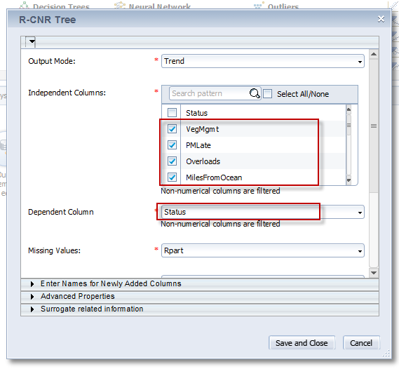 Step 8 – Fill in the Parameters for the R-CNR algorithm
Once the values have been selected, we will be ready to run the algorithm.
NOTE:  I did find that when using the algorithm, there is a
bug in the R algorithm and the column names cannot contain a space
in them.  If they do, you will get an error when you try and run
this algorithm.
Running the Model
What’s great about predictive analysis is that as an analyst, you can build your predictive workflow one step at a time. After each step you have the option of running your algorithm. up so that point. You can use either the “Run Till Here” button on the individual step in the analysis process OR you can press the green arrow to run the entire workflow.
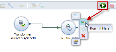
Step 9 – Run the Algorithm
After running the algorithm successfully, we will want to view the results.
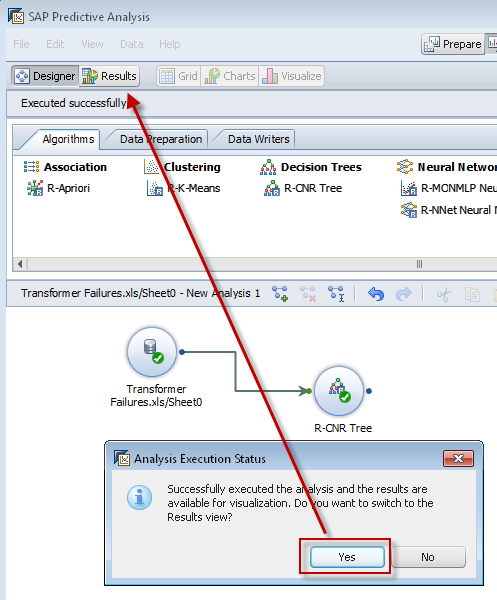
Step 10 – Success! Now Let’s look at the Results
Once we click on the results tab, we’ll be able to see any new content that’s been created. In our case, we will see there is a new column which has been created called, PredictedStatus.
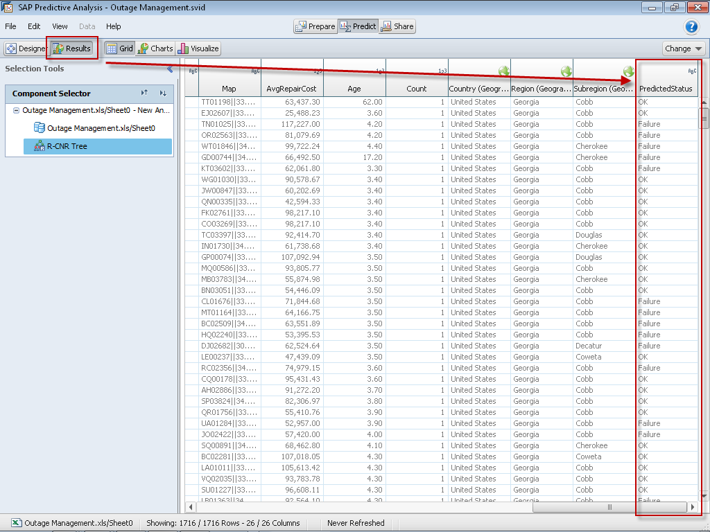 Step 11 – Seeing the Results
Now if we want to drill into the algorithm results generated by Predictive Analysis we can do that as well.
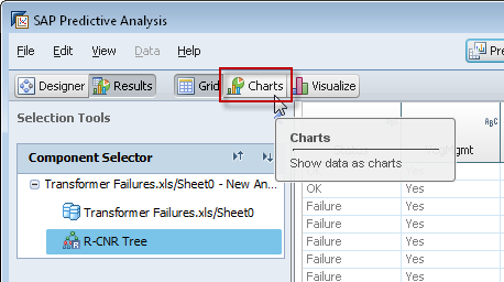
Step 12 – View the Charts
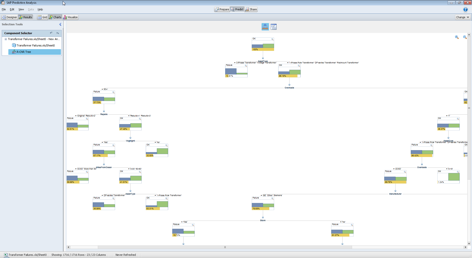
In the case of a R-CNR algorithm, we can see the graphical decision tree which represents the algorithm.
Step 13 – Decision Tree Graphic (Click on link to see full size)
You may not be able to see the entire decision tree on your screen based on the resolution of your screen and the number of levels generated by the algorithm. There is a limit to how many times you can zoom out in order to see the graphic.
If you would rather see the results of the algorithm in text format you can do that as well.
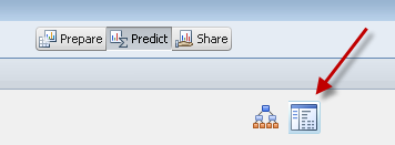 See Algorithm result in Text format
Analyzing the Results
Once I’ve completed all the steps in the process, we can continue to visualize data by leveraging any new columns that have been generated by the output of the workflow. In this case, we have generated one additional column called, PredictedStatus. This can now be used in analysis.
Click on the Visualize (which is next to the Charts button) and we will switch to visualization mode.
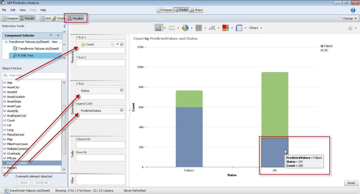 Step 14 – Visualize the Results (Click to see full screen)
In this case, we pulled in Status, Predicted status, and created a Count measure based off the AssetId field. In the visualization above, we are comparing predicted failures vs. actual failures.
In this case we can see that of the assets that are currently OK, 290 of them are predicted to fail!
That’s Insight. That’s Powerful. That’s Predictive Analysis.

Would like to get regular updates please.
To receive regular updates to my blog you can subscribe to my RSS feed or follow me on twitter at @neverknewthat
Really useful, want a follow up.
This is useful ! is there a similar demo on multiple linear regression using SAP Predictive that anyone has come across …please let me know, thanks
The zip file link doesn’t work. could you please help fix it? I wouuld like to see the data to get a sense of the scope of predictive analytics possible with it
I have fixed the .zip download link. Hope this helps.
Useful!
Congratulations! Absolutely A great site!